Context
Windfall's landing page presents a flight-deal alert concept: choose a home airport, watch for unusually low fares, and receive deals by email. Our work covered the public marketing page.
The problem
Cheap-flight hunters still open tab after tab of search engines, pick dates first, and miss the fares that last hours. The product needed a brand that felt like travel, not another comparison widget, plus a landing that explains a reversed model: airport first, destination later.
How we approached it
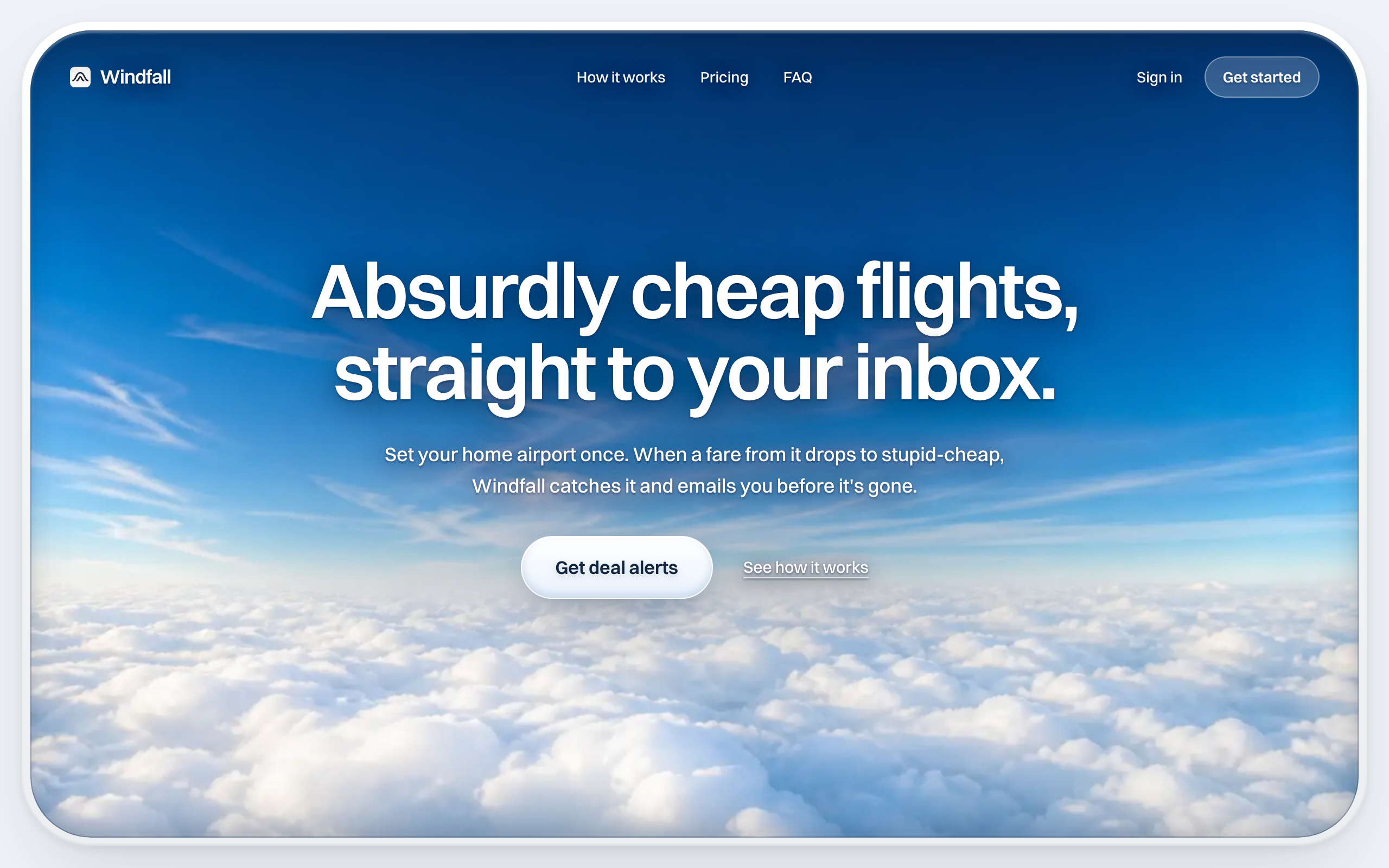
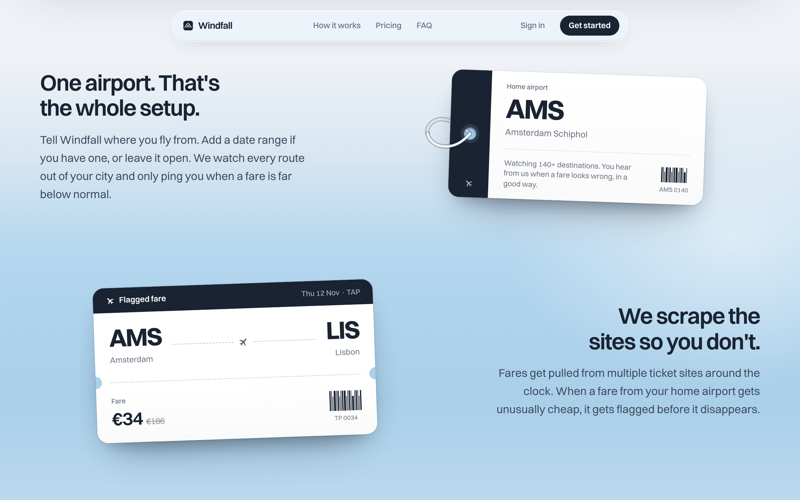
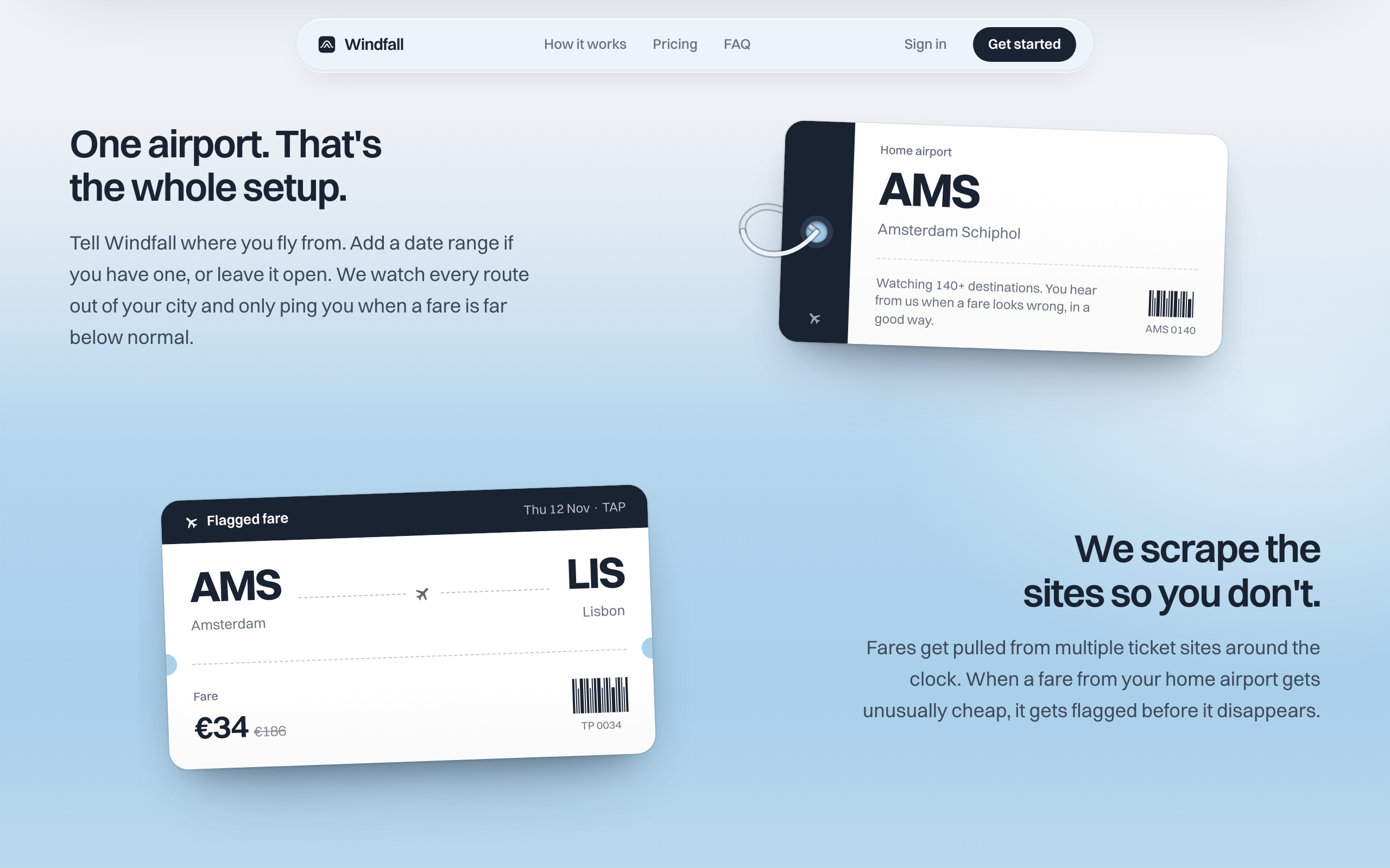
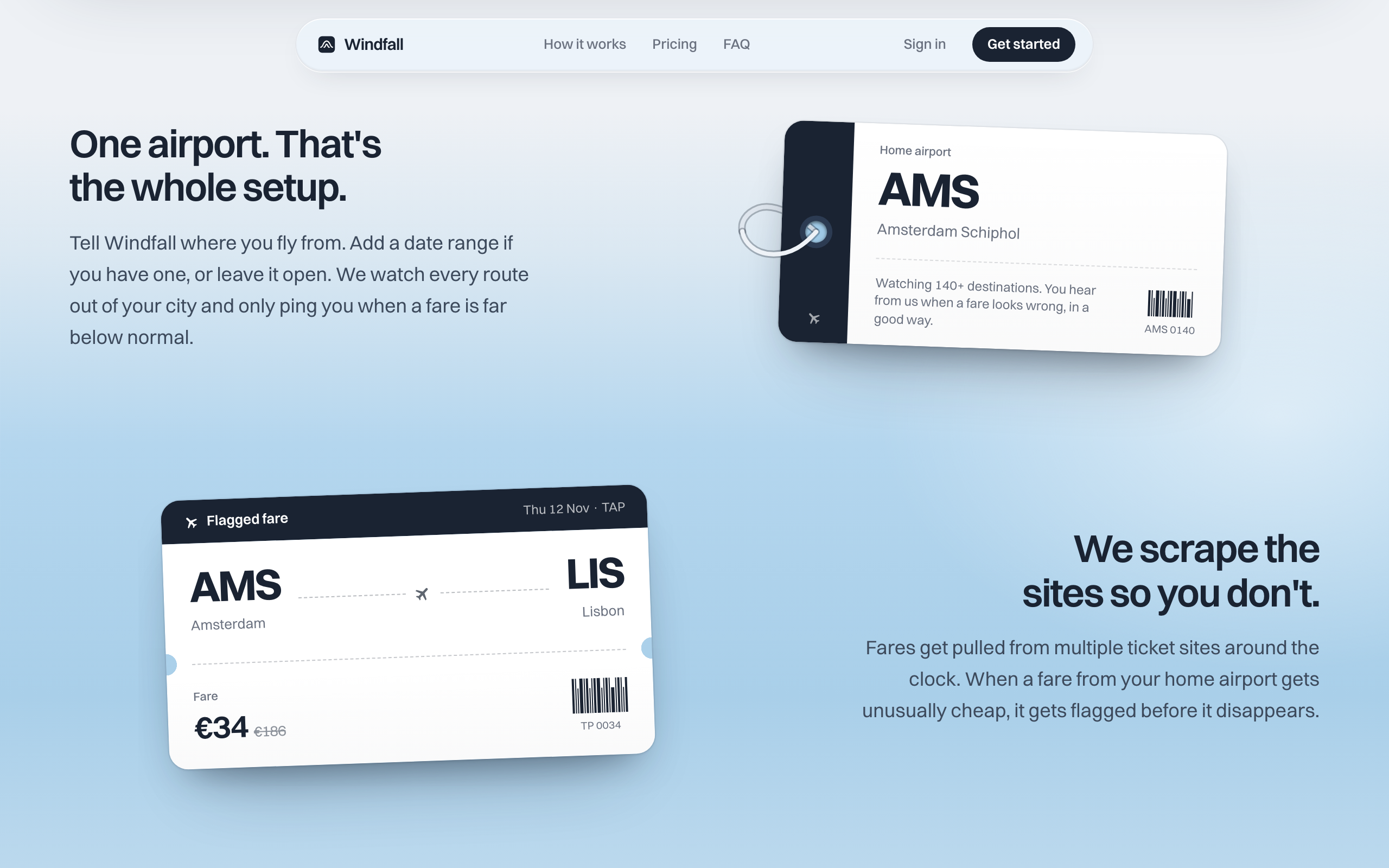
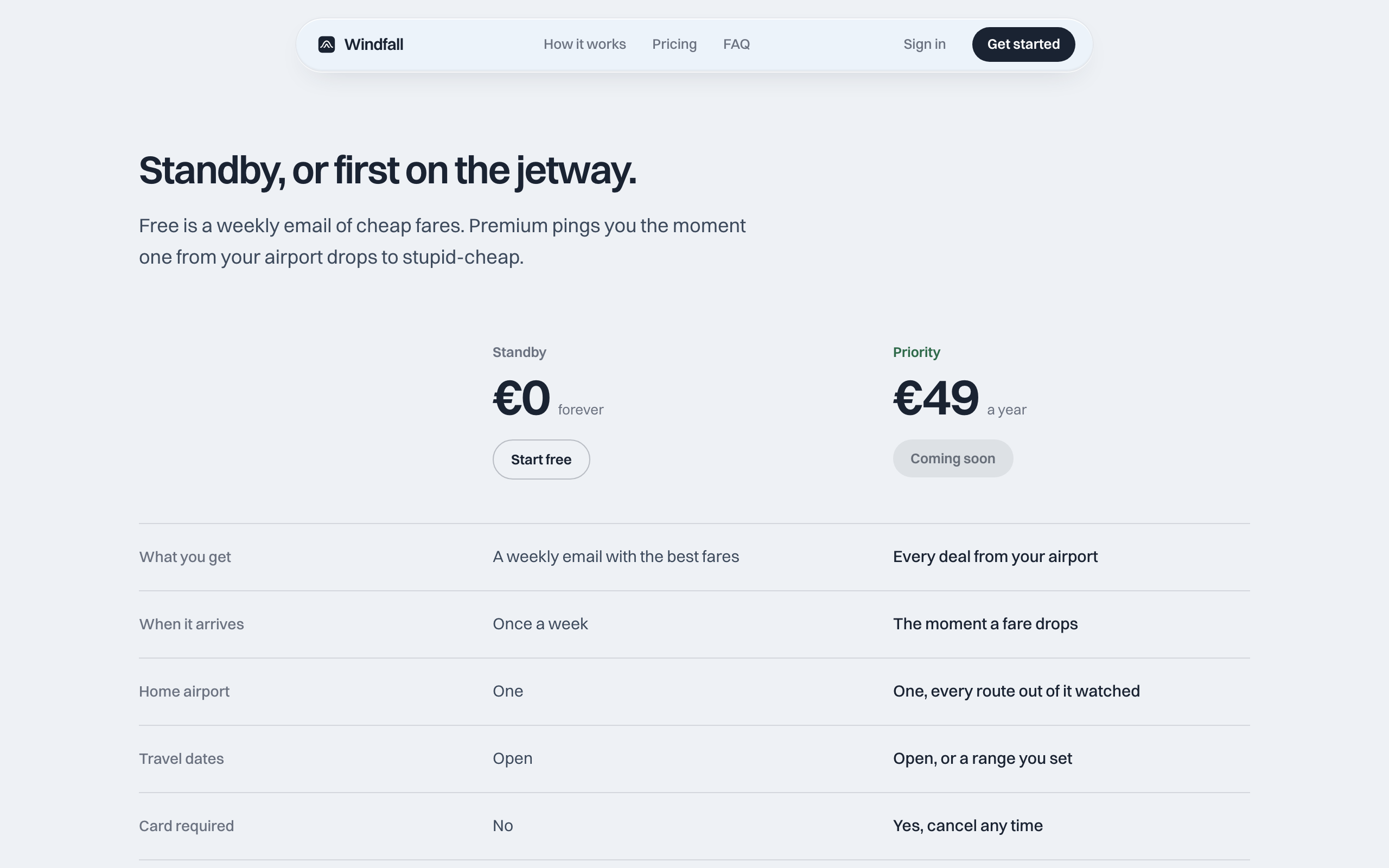
We built a travel-focused marketing page in Next.js: an airplane-window hero, boarding-pass and airmail UI, and a three-step story (home airport, fare search, inbox). The page presents Standby (free weekly digest) and Priority (€49/year instant alerts). The live domain is windfall.flights.
What shipped
- Production marketing site at windfall.flights
- Brand-led landing: sky hero, airport watch UI, fare cards, airmail alert mock
- How-it-works, pricing, FAQ, and signup messaging for EU departure airports
- Standby vs Priority packaging (free digest vs €49/year instant alerts)
Outcomes
- A live landing page that explains alerts without a flight search form
- Copy and UI that make the inverted model obvious in one scroll
- Clear presentation of the proposed free and paid plans
Stack
- Next.js (App Router)
- React 19
- TypeScript
- Tailwind CSS
- Bun
- Vercel